Making a Real-Time NYC Subway Map with Real Weird NYC Subway Data
Earlier this week the NYC MTA released a new digital-first map. The Curbed exclusive that announced its release accurately portrays it as a strange child of both the 1972 map design by Massimo Vignelli and the current “paper” map. One feature of the new map (though it’s harder than it should be to notice at first) is real-time visualizations of each train in the system.
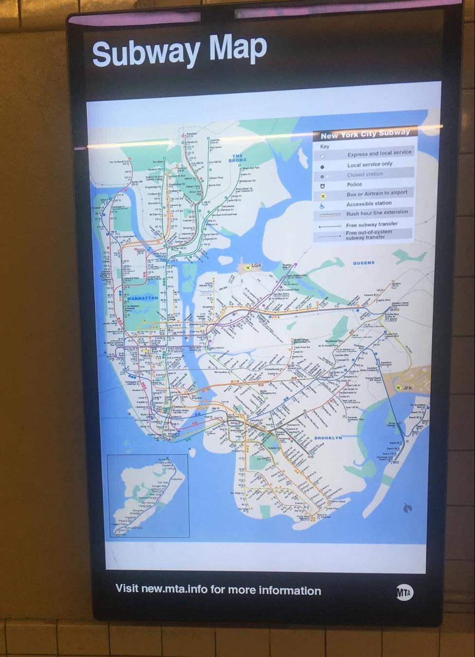
I’ve been working on a similar concept, starting in February 2020, on which progress stalled once I stopped riding the subway regularly in March. But, when I started my batch at Recurse Center I decided to pick up the project again. My inspiration for the map was the large TV screens that the MTA has installed in stations over the last few years, which frustratingly display the “paper” version of the map.
Over the past few weeks at RC the subway map has been my main focus, which is longer than I expected the project to take (and though I have a prototype, I wouldn’t say I’m close to “done”). A big factor in the time the project has taken is some of the quirks in working with MTA data, which based on some of the bugs I’ve seen in the "official" version I’d say the team working on that version had to grapple with as well. I’m not sure I will ever finish this project to a state that would look great on a subway station tv, or be useful, but I do want to point out The Weekendest by Sunny Ng (who also made goodservice.io), which is a great take on the concept, and handles some of the challenges of this kind of project much better than the MTA map does.
For a long time the NYC Subway was almost completely lacking in real-time data. For many years the only line that had even countdown clocks in stations was the L, which seems to be the line the MTA tries out new technology on, likely because it never shares tracks with any other line. Over the last 5 years the MTA has slowly installed countdown clocks in every station, and made the data that powers the countdown clocks available on their website, in apps, and as data online.
Inspired and frustrated by the “paper” maps on the tv screens, I first became interested in working with MTA data in 2018, but I initially started working with bus data, I think for two reasons: the first was because at the time the API key for working with bus data was easier to obtain than for subway data, the second because my morning commute at the time usually started with the bus (The MTA, earlier this year, has fortunately updated the system for obtaining an API key for subway data). I made a small prototype of an iPhone app that would show real-time bus data, but got distracted by learning the Swift programming language and abandoned the project without building functionality beyond what the MTA already provided on their bustime website.
That MTA Bustime website was the other inspiration for what became my map idea. Though you could only view one route at a time (and the functionality is not available on phone-size devices), the Bustime website showed, in addition to countdowns for each stop, the physical location of each bus on a map. This leads us to the first weird thing about working with NYC Subway data, unlike real-time bus data, the subway data does not contain the latitude and longitude data for each train that would make it easy to show them on a map.
Real-Time Transit Data
Transit data for most transit systems is available in formats called GTFS (General Transit Feed Specification) and GTFS Realtime, which were developed by Google (makes you wonder what the “G” originally stood for), but are now widely used. A GTFS file is, “a collection of at least six, and up to 13 CSV files (with extension .txt) contained within a .zip file.” and “The GTFS Realtime data exchange format is based on Protocol Buffers” (which are “Google’s language-neutral, platform-neutral, extensible mechanism for serializing structured data”).
The GTFS Realtime feeds are available through 9 different API endpoints from the MTA. These 9 endpoints roughly correspond to the line colors, with Shuttles combined with trains they share tracks or stations with, and the 1/2/3 and 4/5/6 sharing one endpoint. This list of separate endpoints is another challenge with working with the entirety of the MTA data.
I have exclusively worked with the NYC MTA’s GTFS Realtime feeds through the npm module maintained by Google. It is very possible that some of the challenges I’ve encountered are due to trying to squeeze the “extensible mechanism for serializing structured data” into JSON. Each API response is mostly composed of an array of "Feed Entity" objects like these, but there are a few quirks to working with this data (some maybe because of the JSON conversion).
- Each item in the array has an
idproperty, but unfortunately these ids do not consistently refer to the same train between each update, it’s best to ignore it. - The array consists of pairs of objects that either have a
tripUpdateproperty or avehicleproperty. Each of these have a sub-property calledtripIdthat allows you to unite the pairs, but there are also some that don’t have a corresponding item (usually these represent trips that recently ended or haven’t yet begun). - The data mixes together HH:MM:SS timestamps for data about when a train’s trip started, and Unix timestamps for data about the current time (according to the API) and when a train will arrive at a station (the API provides both arrival and departure times but as far as I have seen they are always identical).
tripUpdateitems show information about the stops a train will make in the future (stopTimeUpdates) and vehicle items show information about the current status of the train, but the firststopTimeUpdateis usually in the past.
I had never heard of Protocol Buffers before starting this project, so I was excited to learn more about them while reading through Designing Data Intensive Applications with fellow Recursers. In the book Martin Kleppmann notes that a, "curious detail of Protocol Buffers is that it does not have a list or array datatype, but instead has a repeated marker for fields (which is a third option alongside required and optional)." This could be the reason for the strange organization of the tripUpdate and vehicle properties.
Calculating Train Locations
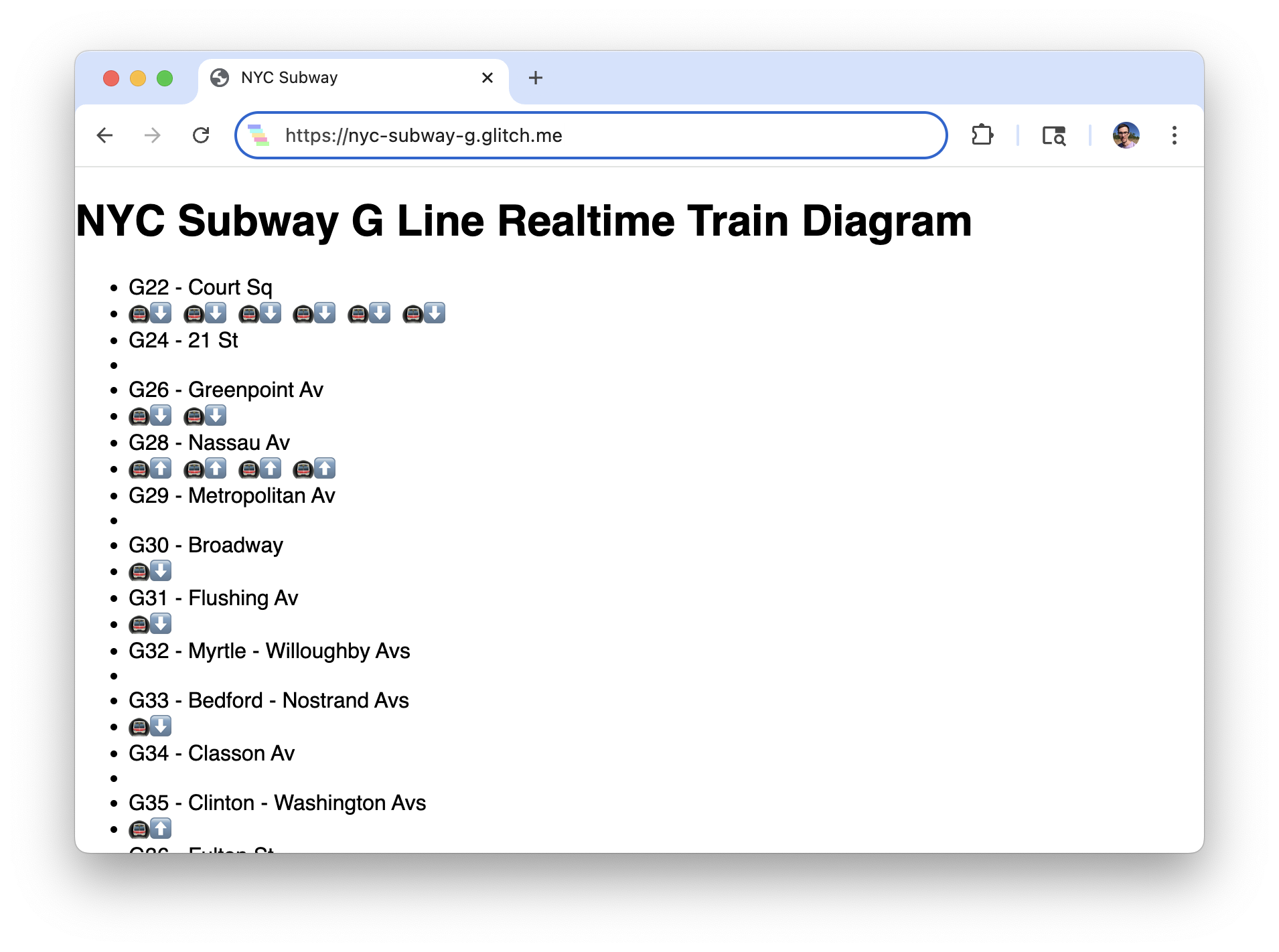
The subway real-time API doesn’t have latitude and longitude data because it is designed to feed data to countdown clock style applications that show when the train will be at a specific station. One of the earliest features that I built into the real-time map was a way to translate these station-by-station countdown clocks into an approximation of the location of each train. My first attempt at this was to just show a list of stations and display an icon for a train between the names of the station it had been at previously and the station it was approaching.
The next step was plotting the stations on a map. To start off, as with the diagram version, I just placed each train at the midpoint between the station it was traveling from and the station it was traveling towards.
A goal I had for the project was not just to show real-time train locations, but to animate them as they moved around the map. To determine how long I should expect a train to take to travel between each station I logged updates from the MTA API for a few hours and noted both the average time for a pair of stations, and the longest time I had seen for the pair. I’m still experimenting a little bit with what values to use as the baseline, but from looking at the logged numbers there does seem to be an expected amount of time for most stations.
G: {
   G22: { N: { avg: 60, max: 71 }, S: null },
   G24: { N: { avg: 123, max: 180 }, S: { avg: 60, max: 106 } },
   G26: { N: { avg: 75, max: 90 }, S: { avg: 108, max: 180 } },
   G28: { N: { avg: 128, max: 180 }, S: { avg: 78, max: 90 } },
   G29: { N: { avg: 60, max: 76 }, S: { avg: 139, max: 180 } },
   G30: { N: { avg: 51, max: 74 }, S: { avg: 70, max: 90 } },
   G31: { N: { avg: 60, max: 90 }, S: { avg: 58, max: 69 } },
   G32: { N: { avg: 66, max: 87 }, S: { avg: 53, max: 84 } },
   G33: { N: { avg: 50, max: 66 }, S: { avg: 67, max: 84 } },
   G34: { N: { avg: 58, max: 90 }, S: { avg: 54, max: 66 } },
   G35: { N: { avg: 68, max: 86 }, S: { avg: 50, max: 81 } },
   G36: { N: { avg: 81, max: 161 }, S: { avg: 59, max: 71 } },
   A42: { N: { avg: 70, max: 177 }, S: { avg: 87, max: 157 } },
   F20: { N: { avg: 68, max: 90 }, S: { avg: 86, max: 165 } },
   F21: { N: { avg: 72, max: 120 }, S: { avg: 76, max: 120 } },
   F22: { N: { avg: 62, max: 90 }, S: { avg: 84, max: 120 } },
   F23: { N: { avg: 90, max: 120 }, S: { avg: 88, max: 150 } },
   F24: { N: { avg: 101, max: 120 }, S: { avg: 67, max: 84 } },
   F25: { N: { avg: 139, max: 180 }, S: { avg: 71, max: 90 } },
   F26: { N: { avg: 120, max: 120 }, S: { avg: 109, max: 150 } },
   F27: { N: null, S: { avg: 81, max: 120 } },
 }
| Trip Id | Trip Start Time | Trip Date | Route | Stop1 Arrival | Stop1 Id | Stop2 Arrival | Stop2 Id | Seconds |
|---|---|---|---|---|---|---|---|---|
| 073476_G..N | 12:14:46 | 20200818 | G | 1597768631 | G33N | 1597768692 | G32N | 61 |
| 074600_G..N | 12:26:00 | 20200818 | G | 1597769103 | G33N | 1597769172 | G32N | 69 |
| 075000_G..N | 12:30:00 | 20200818 | G | 1597769531 | G33N | 1597769596 | G32N | 65 |
| 076501_G..N | 12:45:01 | 20200818 | G | 1597770333 | G33N | 1597770396 | G32N | 63 |
| 077700_G..N | 12:57:00 | 20200818 | G | 1597771043 | G33N | 1597771104 | G32N | 61 |
| 078403_G..N | 13:04:02 | 20200818 | G | 1597771443 | G33N | 1597771524 | G32N | 81 |
| 079600_G..N | 13:16:00 | 20200818 | G | 1597772051 | G33N | 1597772112 | G32N | 61 |
| 080550_G..N | 13:25:30 | 20200818 | G | 1597772711 | G33N | 1597772776 | G32N | 65 |
Secret Stations
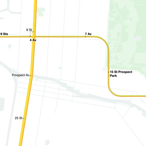
One thing I discovered while logging updates from the MTA API was that it contained secret stations! The MTA provides a list of all of the stations in the system with data like latitude and longitude. Each station has an ID (see Stop1 and Stop2 id in the diagram above and called "GTFS Stop ID" in the list). The stop IDs are a letter and 2 numbers, with the letter often corresponding to the line it serves (or used to historically), and the numbers mostly occurring in sequence. but some trains would have planned "stops" at stations that weren’t in the list! My best guess is that these stations are something station-like in the MTA’s infrastructure, which usually appear near the end of a line.
- "H17" is between Howard Beach/JFK Airport and Broad Channel on the A and Rockaway Shuttle and is likely where the Shuttle trains go to turn around.
- "H19" is before the Broad Channel stop on the A and Rockaway Shuttle and may also be related to Shuttle turnaround?
- "H18" and "H05" are between Broad Channel and Beach 67 St on the A and Rockaway Shuttle, which may have to do with tracks that run between Beach 67 and Beach 90 Sts.
- "A29" is between Penn Station and 14th St on the A, C, and E, which is strange because the C and E stop at 23rd St., which is also between those stations, but has the ID "A30".
- "A39" is between Fulton St. and High St. on the A and C, which might have something to do with the track stubs on the Brooklyn side (one of which is the NYC Transit museum).
- "A58" is between Grant Av. and 80th St. on the A, which, is where the A train emerges from a tunnel to run on elevated tracks.
- "A62" is between Rockaway Blvd. and 104th St. on the A and probably has something to do with the merging between the 3 versions of the A at Rockaway Blvd.
- "R60" is between Queensboro Plaza and Lexington Ave/59th St. on the N, R, and W. My guess is that this has something to do with the N/W and R tracks merging before going into a tunnel.
- "R65" is between the Whitehall St. and Court St. stops on the R, and could also be related to the same track stubs as "A39".
- "B24" is between Bay 50th St and Coney Island on the D, and is probably the MTA Coney Island Yard.
Drawing the Static Map
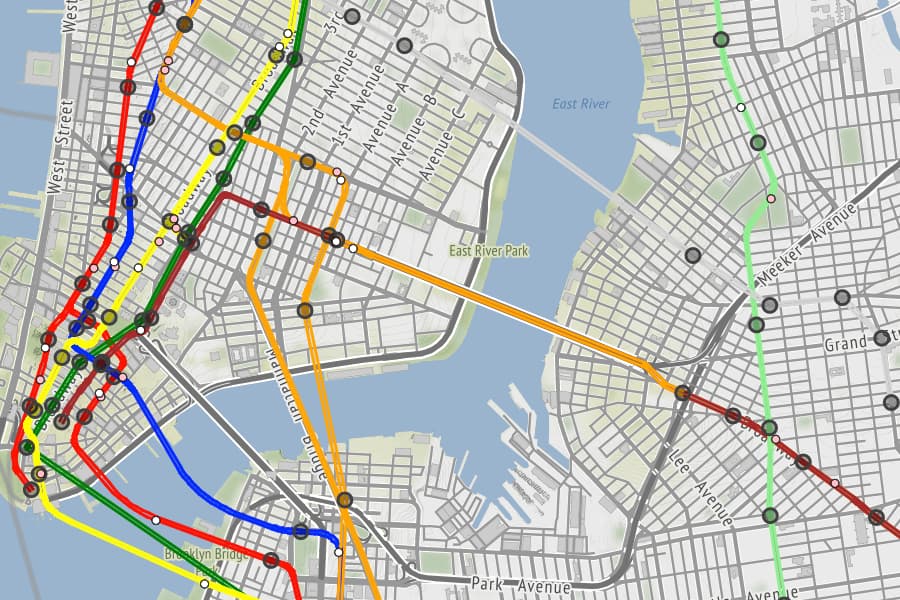
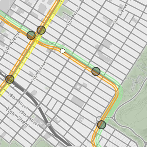
I wasn’t quite satisfied with the angular paths that drawing lines directly between stations created, and I was fortunately able to find Sunny Ng’s advice on extracting shape arrays from the non real-time GTFS MTA data. Using these shape arrays I could draw route maps with smooth curves, and even animate trains along those curves. But one of the things that makes a subway map a subway map is seeing lines that run on the same tracks as parallel lines. I also wanted to double these lines and show Northbound and Southbound trains on separate tracks (something that the new MTA map fails to do).
After trying to approach the parallel lines problem geometrically I was pointed in the right direction by a fellow RC participant and was able to draw great looking lines by treating the Latitude/Longitude points in the shape arrays as vectors (More on this in my interactive slides on this problem and more on the challenge of drawing nice train lines from the Transit app).
A Prototype
My map project is available on GitHub, bugs and all. I did most of the work on the map using only the G train API endpoint. This was a helpful limitation when I was first experimenting with what was possible using the data, but may have led to more bugs because of the slight differences in the data available for each set of lines.
A common complaint about the new official real-time map is that it seems to use as much computer power as it can. My map isn’t much better because it is doing all of the geographic calculations in the user’s browser, my guess is that the MTA’s map is also. One update I might take on over the next week and a half as my time at RC winds down is moving these calculations to a server, and sending only train position changes to the map visualization. This may also help with the bug my current prototype exhibits where leaving and coming back to the tab a few minutes later will cause trains to fly around the map without regard for the lines or stations.
The MTA data is weird because it’s created by a system that could never have anticipated the kind of systems that now try to contain it. Overall, working with and working around the weirdness in the data has been challenging, but a great reminder that the most interesting real-world problems are often hard to jam into our brittle computer systems, and that’s probably a good thing.